Data visualization has become an essential skill in our data-centric world, transforming complex datasets into clear, actionable insights.
AI is transforming data visualization and how we handle data, significantly impacting how we handle data.
Numerous AI tools for data visualization have been launched recently, offering new capabilities and efficiencies.
For developers, researchers, students, or anyone who spends considerable time working with data, exploring all these tools can be time-consuming.
So, I thought of compiling a list of the 7 best AI Tools For Data Visualization. Of course, I did my own research before putting them on the list. Some of them are free data visualization tools and some are paid.
These tools simplify the process of analyzing, understanding, and displaying data, making them invaluable assets in your data visualization toolkit.
But feel free to explore each AI Data Visualization Tool yourself. I have mentioned, features, limitations, and pricing plan as well to help you make informed decisions.
Note these are my personal opinion, you may like to explore more. At AIUtilityTools, we talk about AI Tools & Software, and share our knowledge, and more. If you are interested, then I invite you to explore our website.
What is Data Visualization in AI With Example?
AI data visualization refers to the application of artificial intelligence (AI) techniques to analyze and present data in a visual manner.
It uses machine learning algorithms to find patterns, trends, and insights in very big datasets. This makes complicated data easier to find and understand.
For example, AI models can make charts or graphs to show expected trends in prediction analytics.
AI can look at and see the results of mood analysis as graphs in natural language processing. This helps people understand the emotional tone of text data.
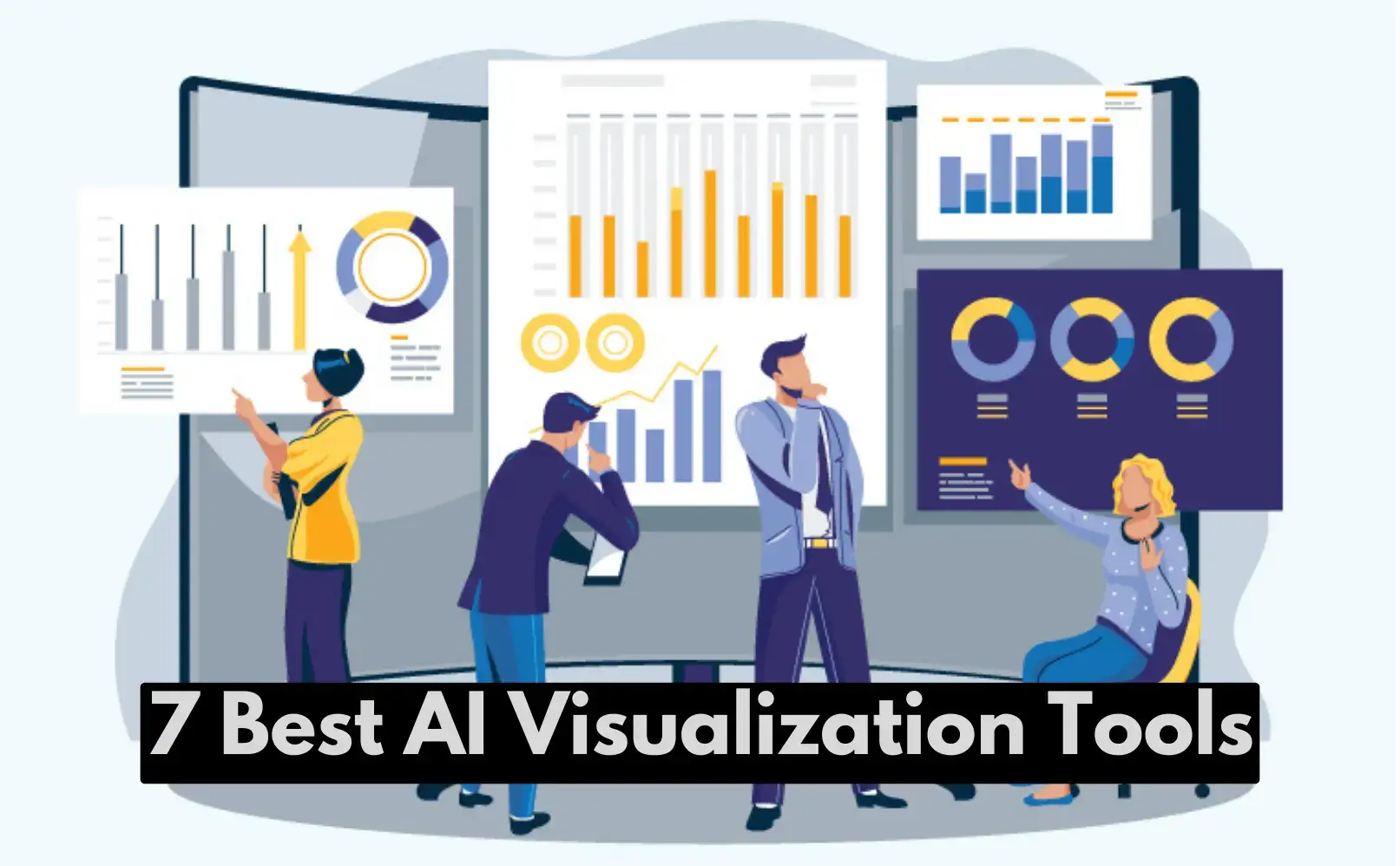
7 Best AI Tools for Data Visualization
AI Data Visualization Tools1️⃣ Tableau

Tableau allows anyone to analyze and visualize data easily with its user-friendly interfaces. It enhances data visualization using AI techniques.
Tableau is a leading platform in interactive data visualization, known for its continuous advancements in AI recommendation and automation features.
Features of Tableau AI
- To create visualizations, Ask Data uses natural words.
- Smart recommendation for the best types of charts.
- Formatting labels and making trendlines automatically
- Simple drag-and-drop tools make it easy to analyze quickly
- Brings Python, R, and Einstein Discovery together
Limitations of Tableau AI
- Coding skills are needed for advanced custom images
- Augmented data put top competitors behind
- Some AI functions can only be found in the newest versions
- Einstein Discovery needs a $20-a-month Ideas license.
Tableau – Best For
⭕ Data Analysts and Data Scientists: Highly valued for robust data visualization and exploration, enabling complex analysis and interactive dashboards creation.
⭕ Business Intelligence Professionals: Indispensable for generating reports, aiding decision-making with visualizations, and sharing insights across teams.
⭕ Executives and Decision Makers: Presents complex data in visually appealing formats for quick trend monitoring, KPI tracking, and data-driven decisions.
⭕ Marketing and Sales Teams: Analyzes customer behavior, campaign performance, and sales data with interactive features for trend identification and strategy optimization.
⭕ Educators and Researchers: Visualizes research findings, analyzes large datasets, and effectively communicates insights in academic and research settings.
⭕ Small to Large Enterprises: Scales effectively across industries like finance, healthcare, and retail, offering tailored solutions for diverse data visualization needs.
Tableau AI Pricing
| Plan | Per User/Month | Features |
|---|---|---|
| Tableau Creator | $75/Month | Every deployment needs a Creator. Includes Tableau Desktop, Prep, and a Server or Online Creator license. |
| Tableau Explorer | $42/Month | Self-service analytics lets you search for reliable data and answer queries faster. One Tableau Server Explorer license is included. |
| Tableau Viewer | $15/Month | Engage with dashboards and visualizations on a secure, simple platform. |
AI Data Visualization Tools2️⃣ Microsoft Power BI

Power BI is a self-service business intelligence platform that enables users to create customized dashboards and interactive reports for data storytelling and visualization.
Power BI is a tool for creating interactive business intelligence dashboards using Microsoft’s stack in a fast and simple way.
Features of Power BI Visuals
- Recommendation of automated charts based on data types
- Captions for images that are written in natural English
- Quick Insights finds patterns and trends on its own.
- Finding anomalies in graphs to show which ones are outliers
- When you connect Azure ML model forecasts,
Limitations of Power BI Visuals
- You still need design skills for advanced visual customization
- Some automatically created charts are hard to understand.
- Premium license is needed for AI-powered predictions
- Important for Microsoft’s first-party data
Microsoft Power BI – Best For
⭕ Business Analysts and Data Professionals: Visualize and analyze data from various sources with an intuitive interface and integration with Microsoft products.
⭕ Small to Large Enterprises: Scalable solutions for interactive reports, dashboards, and real-time analytics across departments.
⭕ IT Teams and Developers: Robust data connectivity and customization options for integrating with existing systems and embedding analytics.
⭕ Executives and Managers: Intuitive dashboards for monitoring KPIs, tracking business performance, and strategic planning.
⭕ Educators and Researchers: Analyze complex datasets and present research findings effectively in educational and research environments.
⭕ Marketing and Sales Professionals: Optimize marketing strategies with predictive analytics and AI capabilities to analyze customer behavior and sales trends.
Power BI Visualization Pricing
| Plan | Price | Features |
|---|---|---|
| Power BI Free | Free | Create and publish Power BI reports, Collaborate with others |
| Power BI Pro | $12 per user/month | Create and publish Power BI reports, Collaborate with others, Advanced AI, dataflows, datamarts, XMLA endpoint read/write |
| Power BI Premium per user | $20 per user/month | Build and publish Power BI reports Work with others, Dataflows, datamarts, XMLA endpoint read/write, advanced AI Any user can access Power BI content without a license. |
| Power BI Premium per capacity | $4,995 per capacity | Create Power BI Desktop reports, Share and collaborate Power BI reports Advanced AI, dataflows, datamarts, XMLA endpoints, Everyone can use Power BI without a license. |
AI Data Visualization Tools3️⃣ Sisense
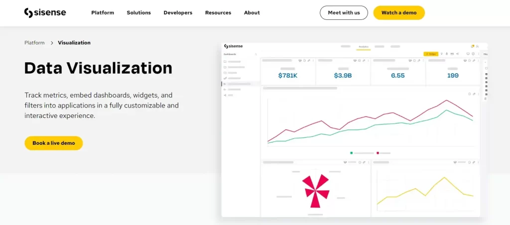
Sisense enables users to process, analyze, and display intricate data using user-friendly dashboards. It uses AI techniques to improve the process of exploring data.
Sisense does not prioritize AI as a core part of its value proposition. The main emphasis is on robust and adaptable data preparation, visualization, and analytics for advanced users.
Features of Sisense
- Natural Language Generation for telling stories
- Using machine learning to find anomalies
- Forecasting skills for making predictions
- Insights for statistical research with the help of AI
- It’s easy to integrate into custom apps
Limitations of Sisense
- Coding is needed for more complicated features
- AutoML is not as good as other machine learning tools.
- Flexibility, not automation, is still the main focus.
- Some models don’t have enough interpretability
Sisense Best For
⭕ Enterprise-Level Businesses: Handles large datasets and offers scalable solutions for complex data analytics.
⭕ Data Engineers and Analysts: Provides powerful analytics tools and intuitive interfaces for deep data analysis and visualization.
⭕ IT and Business Intelligence Teams: Integrates easily with various data sources, automates reporting, and builds comprehensive dashboards.
⭕ Executives and Decision Makers: Offers real-time analytics and customizable dashboards for quick, informed decision-making.
⭕ Healthcare and Financial Services: Tailors advanced analytics to meet regulatory compliance and data security needs.
⭕ Startups and Growing Businesses: Flexible pricing and scalable solutions for evolving data analytics requirements.
Sisense AI Pricing
- Starter Plan: $200 a month for up to 500,000 events a month
- Basic Plan: $700 a month, up to 5 million events a month
- Advanced Package: The costs start from $69,000, $138,000 to $207,000
- Pro Package costs: $109,000, $218,000, or $327,000.
- Perpetual License: The License cost are $4,200 per user
AI Data Visualization Tools4️⃣ MonkeyLearn
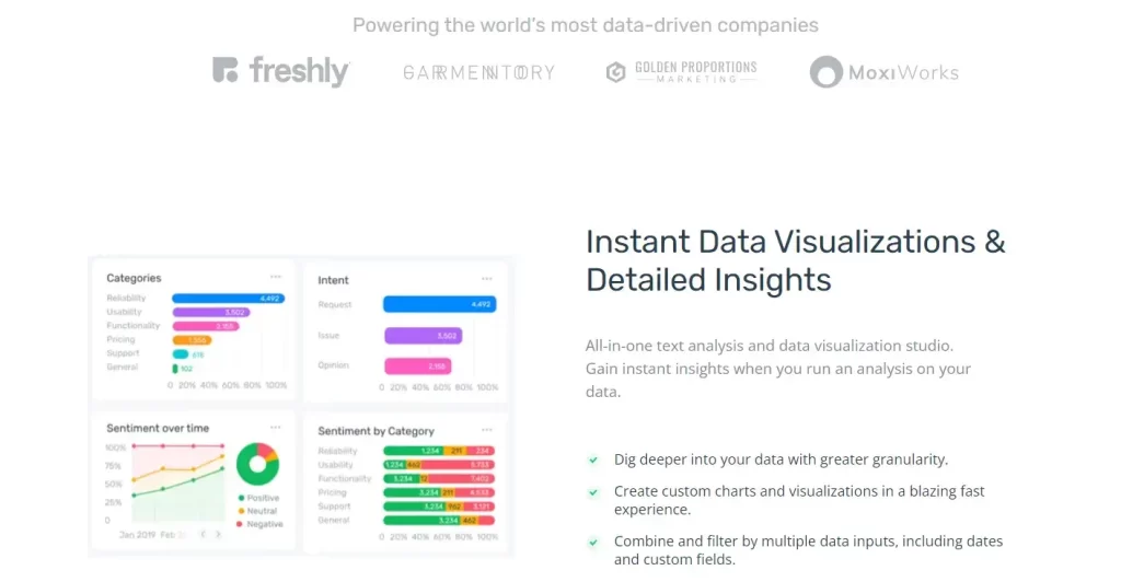
MonkeyLearn offers text analysis and data extraction models to interpret unstructured text data effectively.
The main value is to extracting insights from text to visualize trends across content collections.
Features of MonkeyLearn
- Cloud-based, so there’s no need for complicated setup
- Fully trained models that can do things like mood analysis, language detection, keyword extraction, and more.
- It’s easy to connect to BI tools like Tableau for visualizations.
- Custom teaching options for models
- Large enough to handle lots of text
Limitations of MonkeyLearn
- Pay more attention to text analytics and less attention to other data.
- As a service instead of a full platform from start to finish
- More customization choices may be needed for advanced users.
- For big datasets, prices can get high.
MoneyLearn – Best For
⭕ Business Analysts and Data Professionals: Offers powerful text analysis and machine learning tools for extracting insights from unstructured data like customer feedback and social media.
⭕ Customer Support Teams: Automates text classification and sentiment analysis to streamline customer interactions and improve response times.
⭕ Marketing Teams: Analyzes customer sentiment and trends from social media and reviews to optimize marketing campaigns and messaging.
⭕ Developers: Integrates easily with existing applications through APIs for adding natural language processing (NLP) capabilities.
⭕ Educators and Researchers: Utilizes machine learning models for educational research and text analysis tasks, enhancing data-driven insights.
MonkeyLearn Pricing
| Plan | Price | Features |
|---|---|---|
| Free | Free | 1,000 API calls per month, The ability to train your own models with up to 10,000 documents |
| Standard | $50 per month | 10,000 API calls per month, The ability to train your own models with up to 100,000 documents |
| Plus | $100 per month | 50,000 API calls per month, The ability to train your own models with up to 1 million documents |
| Enterprise | Custom pricing | Unlimited API calls per month, The ability to train your own models with unlimited documents |
AI Data Visualization Tools5️⃣ Plotly

Plotly is a free graphing library used to create interactive, high-quality graphs for online publication. It automates analysis and visualization using AI functions.
Plotly uses AI/ML to automatically create and update data visualizations through programming. It requires coding instead of using no-code tools for analytics and reporting.
Features of Plotly
- Dashboards automatically change when data does.
- Creates plots and finds patterns in CSV files
- Tag images, extract text, and do mood analysis
- Brings together machine-learning models from the most popular frameworks
- Takes in large amounts of real-time data
Limitations of Plotly
- You need to code in Python for full capabilities.
- Not enough advanced data and modeling tools
- More AI and ML for automation than for ideas
- There could be more beginner-friendly documentation.
Plotly – Best For
⭕ Data Scientists and Analysts: Provides interactive plotting libraries for creating rich, customizable visualizations and dashboards.
⭕ Developers: Integrates easily with Python, R, and JavaScript environments, offering flexibility in application development and customization.
⭕ Business Analysts: Generates insightful charts and graphs from complex datasets, aiding in data exploration and decision-making.
⭕ Educators and Researchers: Utilizes interactive plots and visualizations for presenting research findings and teaching data analysis concepts.
⭕ Enterprise-Level Applications: Scales effectively for building interactive, real-time dashboards and reports across departments.
Plotly Pricing
| Plan | Price | Features |
|---|---|---|
| Plotly for Python | Free | Open-source software, licensed under the MIT license |
| Dash | Free | Open-source software, licensed under the MIT license |
| Dash Enterprise | Custom quote | Additional features for enterprise deployments |
| Plotly Chart Studio | Free and Premium | Free version with limited features, Premium version with more features |
AI Data Visualization Tools6️⃣ Qlik
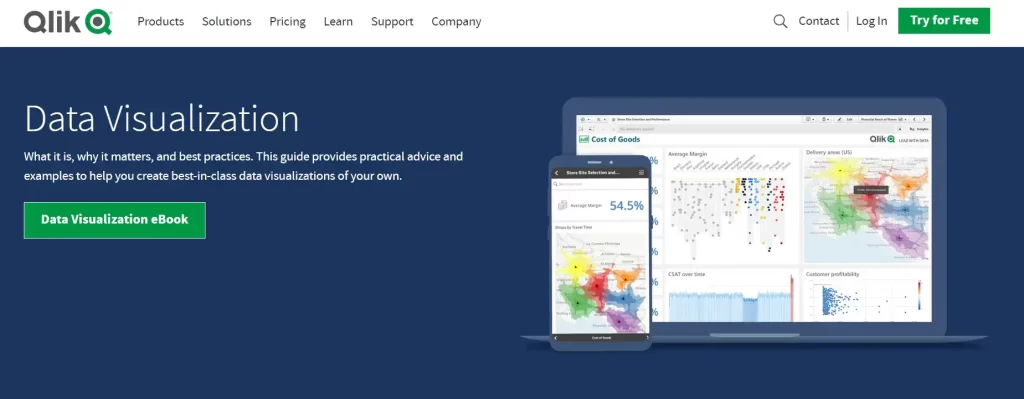
Qlik provides a complete Business Intelligence platform for self-service data analytics and visualization. Recent releases have included AI-powered features.
Qlik visualizations benefit from extensive development over time rather than recent AI advancements. It is strong for versatile searching with guided analytics.
Features Of Qlik
- Associative insights to find connections
- Conversational analytics using natural language
- Intelligent visualizations adapted to data sources
- Centralized alerts and tracking on dashboards
- Good at mapping and geospatial analysis
Limitations of Qlik
- It’s hard to get good at making your own visualizations.
- Not much more to say than what the data already shows
- Not keeping up with enhanced analytics skills
- Dependent on limitations of old structures
Qlik – Best For
⭕ Business Analysts and Data Professionals: Offers intuitive data discovery and visualization tools for exploring and analyzing complex datasets.
⭕ Enterprise-Level Businesses: Scales effectively for large-scale deployments with robust analytics capabilities and real-time data integration.
⭕ IT Teams: Integrates seamlessly with existing IT infrastructure and data sources, facilitating data governance and security.
⭕ Executives and Decision Makers: Provides interactive dashboards and advanced analytics for monitoring KPIs and making data-driven decisions.
⭕ Healthcare and Financial Services: Tailors solutions for regulatory compliance and data-driven insights in specialized industries.
Qlik Pricing
| Plan | Data for Analysis | Price |
|---|---|---|
| Standard | 50 GB/Month | $20 user/month |
| Premium | 50 GB to 100 TB/Month | $2,700/month |
| Enterprise | 500 GB to unlimited/Month | Contact Qlik |
f
AI Data Visualization Tools7️⃣ Domo AI
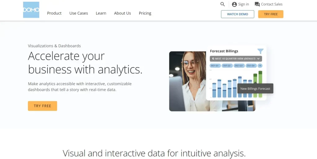
Domo connects business data to create user-friendly dashboards and reports for comprehensive data analysis and visualization. It uses AI to improve data visualization.
Domo is a platform that helps create interactive dashboards quickly and easily by using automation. It prioritizes visibility over advanced insights or decision guidance.
Features of Domo AI
- Magic ETL automatically sorts, cleans, and joins data.
- Use natural language to search for data
- Customizable alerts are sent when certain measures are met
- Supports dashboards with predictive capabilities
- The library of drag-and-drop customizable visualizations is growing.
Limitations of Domo AI
- Augmented analysis is behind the competition
- Advanced features need to be discussed.
- focus on the data center instead of end-to-end analytics
- Predictive looked at time records instead of machine learning.
Domo AI – Best For
⭕ Business Analysts and Data Professionals: Provides AI-powered data visualization and analytics tools for exploring and deriving insights from large datasets.
⭕ Executives and Decision Makers: Offers customizable dashboards and real-time data updates for monitoring business performance and making informed decisions.
⭕ Marketing and Sales Teams: Utilizes AI capabilities to analyze customer data, optimize marketing campaigns, and improve sales forecasting.
⭕ IT and Data Engineers: Integrates seamlessly with existing data sources and IT systems, enhancing data governance and scalability.
⭕ Healthcare and Retail Industries: Tailors AI solutions for specific industry needs such as patient care analytics and retail sales performance analysis.
Domo AI Pricing
| Plan | Price | Includes |
|---|---|---|
| Free Forever | $0/month | Free self-service learning, help with getting started for 30 days, and 300 credits every month |
| Standard | Starting at $300/month | Support at level 1, one free training lesson, and extra 100 credits every month |
| Enterprise | Contact Sales | Account team assigned, high update rate, bulk discount |
| Business Critical | Contact Sales | There are extra bulk savings available for AWS private links, HIPAA environments, and more. |
How to Choose the Right AI Tools for Data Visualization?
There are a few things you need to think about when picking the right AI tool for data visualization. Remember these important things:
- Goals and Purpose of Visual Data: Know what your data analysis is for and why you are doing it. This will help you figure out what a tool should have.
- Ease of Use: The tool should be simple and easy to understand, even for people who are not trained in computing.
- Scalability: The tool should be capable of examining both small and large datasets quickly and accurately.
- Data Connectivity: Think about how the info you want to see will be linked to the tool.
- Dashboard Design: The dashboard of the tool is where the visualizations are seen, so its design is very important.
- Automation Capabilities: AI tools can do boring, time-consuming jobs automatically, deal with a lot of data, clean and prepare it, and do complicated calculations and analyses with little help from humans.
What Are the Benefits of Using AI Tools for Data Visualization?
Here are the list of benefits of using Top AI Tools for Data Visualization:
✅ Automated Data Visualization: AI programs can make charts, graphs, and other types of visualizations automatically, which saves time and effort.
✅ Data Exploration and Insight Discovery: AI can help find patterns and trends that are hard to see by hand, which can lead to new discoveries and insights.
✅ Personalized Data Visualizations: AI can be used to make visualizations that are more relevant to each user by taking their wants and preferences into account.
✅ Interactive Data Visualizations: AI can make engaging data visualizations that let people look at data in a more natural way.
✅ Explainable AI: AI can be used to make machine learning models more clear and easy to understand by explaining their results.
How Can AI Tools Be Used to Improve Data Visualization?
AI tools can be used to improve data visualization in a number of ways:
Automated chart and graph creation: AI systems can be used to create charts and graphs automatically based on a set of data. This may save time and effort and also help make sure the graphs and charts are correct and up to date.
Pattern recognition: To find similarities in data, AI algorithms can be used. This can help you find ideas and trends that are hidden and hard to see otherwise.
Interactive visualizations: Visualizations that are driven by AI can be interactive, which makes exploring data more fun and dynamic. This can help people understand the data better and get more out of it.
Predictive analytics: AI systems can be used to guess how data will trend in the future. For businesses that want to make better choices about their goods, services, and processes, this can be useful.
Augmented analytics: The capabilities of human data analysts can be enhanced by AI-powered tools. This could make the work of analysts easier and help them find new ideas in the data.
FAQs Related To “Best AI Tools For Data Visualization“
What are the key benefits of using AI tools for data visualization?
A1: AI tools for data visualization offer enhanced data analysis, automated insights, ease of use, and the ability to handle large datasets efficiently. They also help in creating more accurate and visually appealing charts and graphs.
Who can benefit from using these AI tools?
A2: Developers, researchers, data analysts, students, and anyone who regularly works with data can benefit from using AI-powered data visualization tools. These tools can help simplify complex data and improve decision-making.
How do AI tools improve data visualization?
A3: AI tools improve data visualization by automating data processing, providing intelligent recommendations, and generating visualizations that highlight key trends and insights. This reduces the time and effort required to analyze and interpret data.
What should I consider when choosing an AI tool for data visualization?
Consider factors such as ease of use, integration capabilities, customization options, the types of visualizations supported, and the tool’s ability to handle your specific data needs. Cost and community support are also important considerations.
Can beginners use AI tools for data visualization effectively?
Yes, many AI tools are designed with user-friendly interfaces and provide tutorials and support to help beginners get started. These tools often include features that guide users through the process of creating visualizations.
Are there any free AI tools for data visualization?
Yes, several AI tools for data visualization offer free versions or trials with limited features. These can be a good starting point for users to explore and understand the capabilities before investing in a paid version.
What are some popular AI tools for data visualization mentioned in the article?
The article highlights seven popular AI tools for data visualization, including [Tool A], [Tool B], and [Tool C]. Each of these tools offers unique features and benefits to enhance your data visualization efforts.
Conclusion For Choosing The Best AI Tools For Data Visualization
Finally, this article talks about the best AI data visualization tools that let you do analysis without knowing how to code.
As data gets more complicated, there will be a huge need for people who can visualize it in a way that makes sense and tells stories.
With these AI tools, it’s easy to make dashboards that everyone can interact with and see trends and predictions.
Augmented analytics improves people’s skills, making it easier for more people to work with data.
AI visualization opens up new job opportunities for people who are good at sharing data-driven insights that move companies and knowledge forward.
The people who work in analytics in the future will need smart storytellers who can get to the heart of data.
To do well in this quickly growing area, you should learn how to use AI-powered visualization tools better.